CONCEPTUAL BRAND REDESIGN
Naia Fine Jewelry
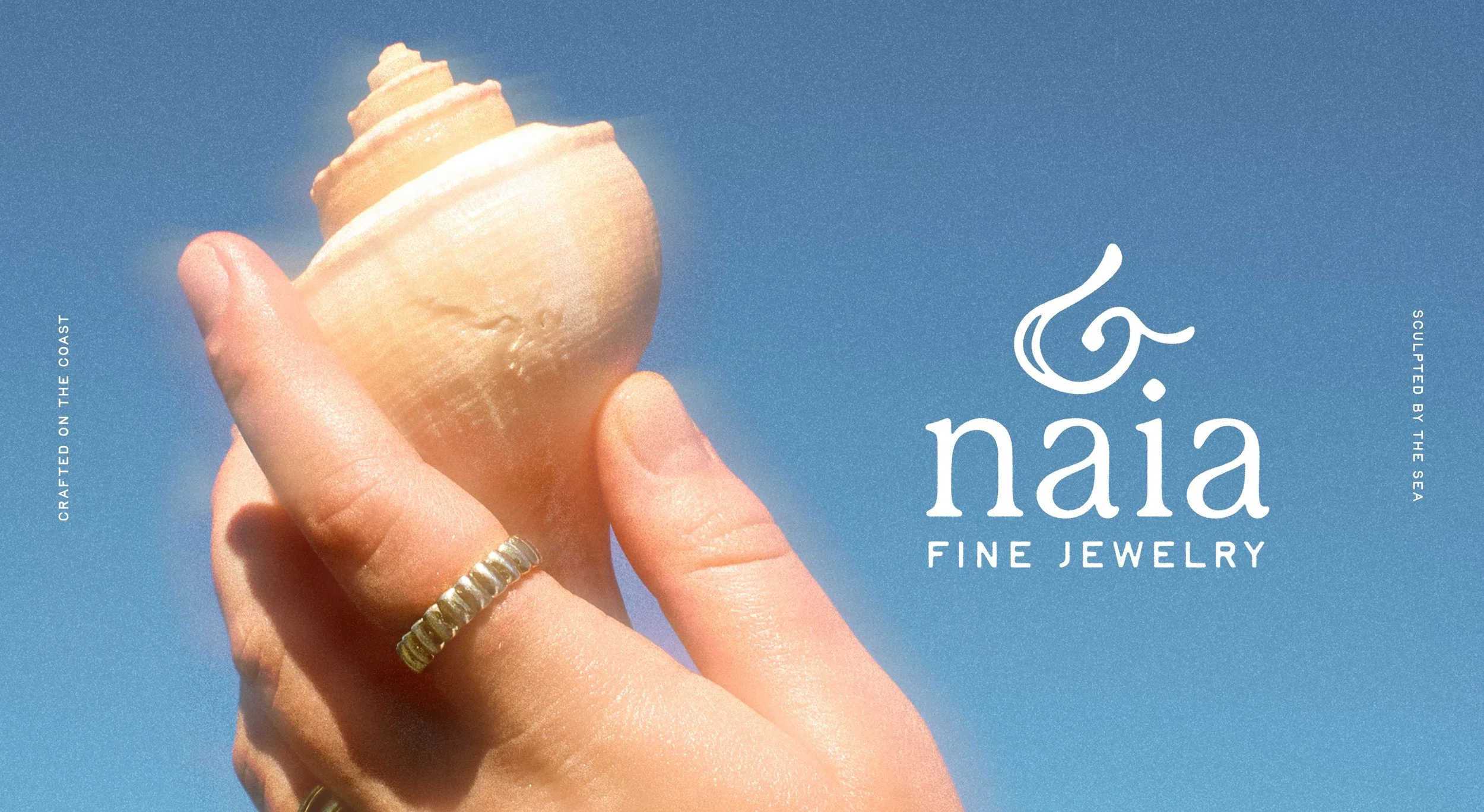
In collaboration with Kate Allen and Gwenivere Burvall, we developed a brand identity for Naia (nye-uh), a conceptual jewelry brand based in Mendocino, California. Inspired by the raw beauty of the Northern California coast and its translation of the word ‘seafoam’, Naia was created to bring elegant, organic jewelry to those who feel most at home by the ocean.
The project deliverables include brand identity, packaging design, product photography, website, and social media presence for the brand. The use of our original photography reflects my passion for creative direction along with adding a personal touch to the overall branding project. This project was collaborative from start to finish, but especially so during the brand development stage.
BRANDING | PACKAGING | CONTENT CREATION | PHOTOGRAPHY | ART DIRECTION
FIGMA
ILLUSTRATOR
PHOTOSHOP
AFTER EFFECTS
Brand + Packaging Designer, Photographer, Social Video Editor
Brand + Packaging Designer, Photographer, Photo Editor
Brand + Packaging Designer, Copywriter, Social Content Creator
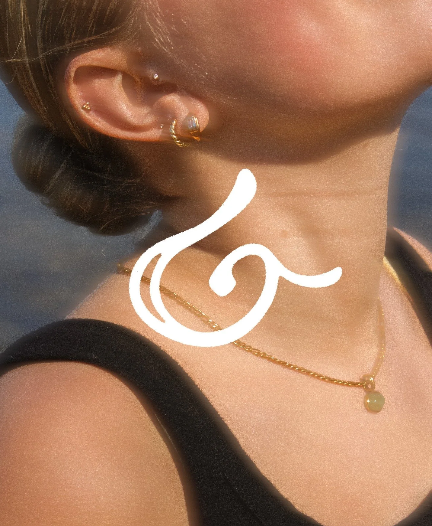
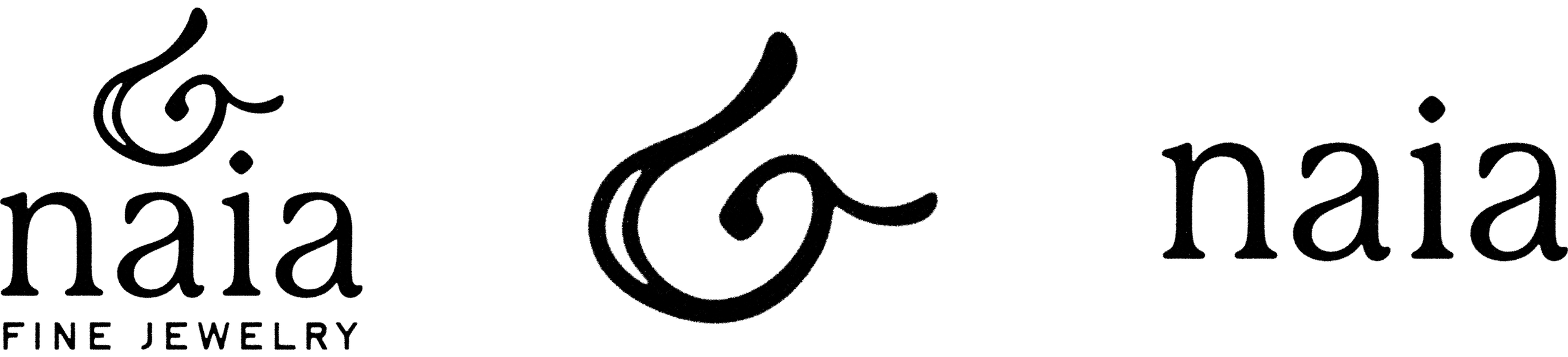
Our logo draws from a range of coastal references. The swirl reflects a seashell spiral, its spine suggests an earring hook, its tip forms a wave, and the inner counter evokes a sea foam bubble.
LOGO
Brand Identity
COLOR PALETTE
Brand Identity
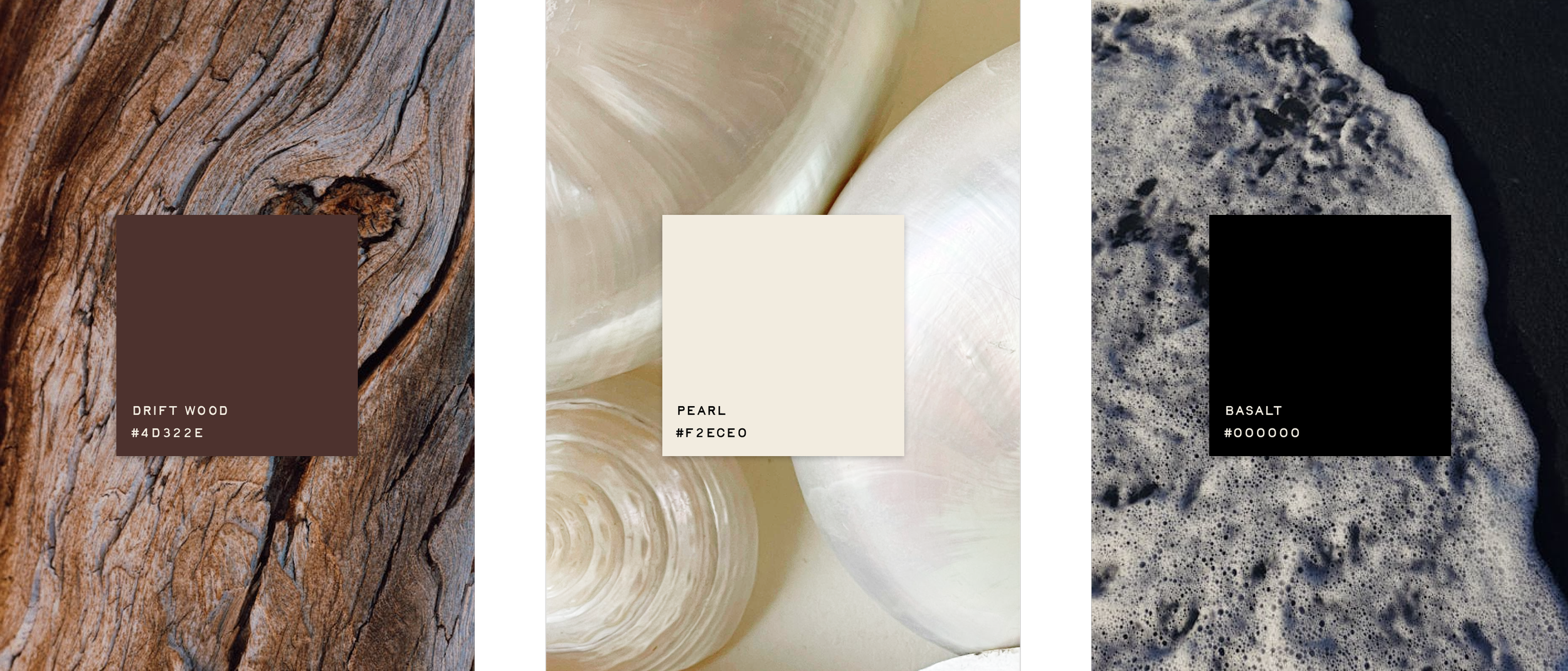
The Naia color palette draws inspiration from the coast, just like the brand itself. Our three core colors—driftwood, pearl, and basalt—intentionally creates a neutral, organic foundation.
TYPOGRAPHY SYSTEM
Brand Identity
PRIMARY

SECONDARY
TERTIARY
BADGES
Brand Identity
PHOTOGRAPHY
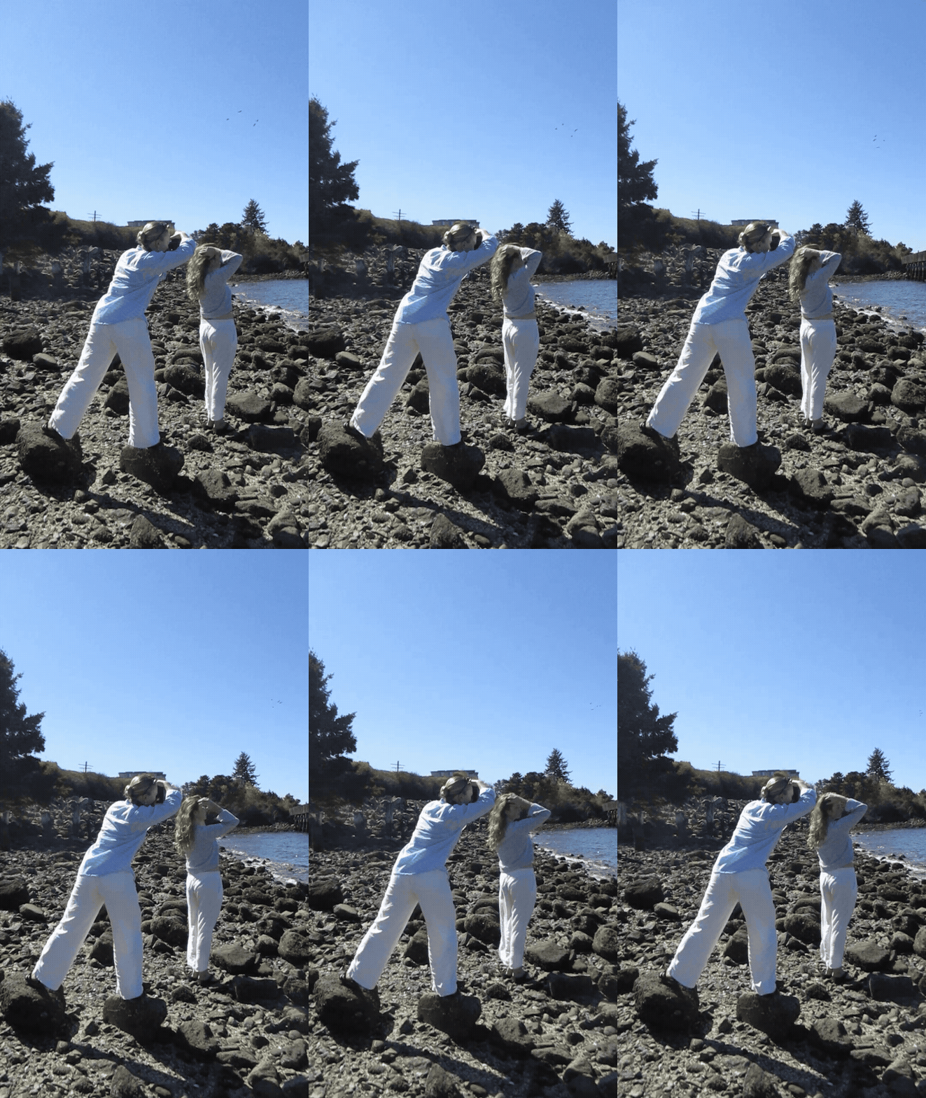
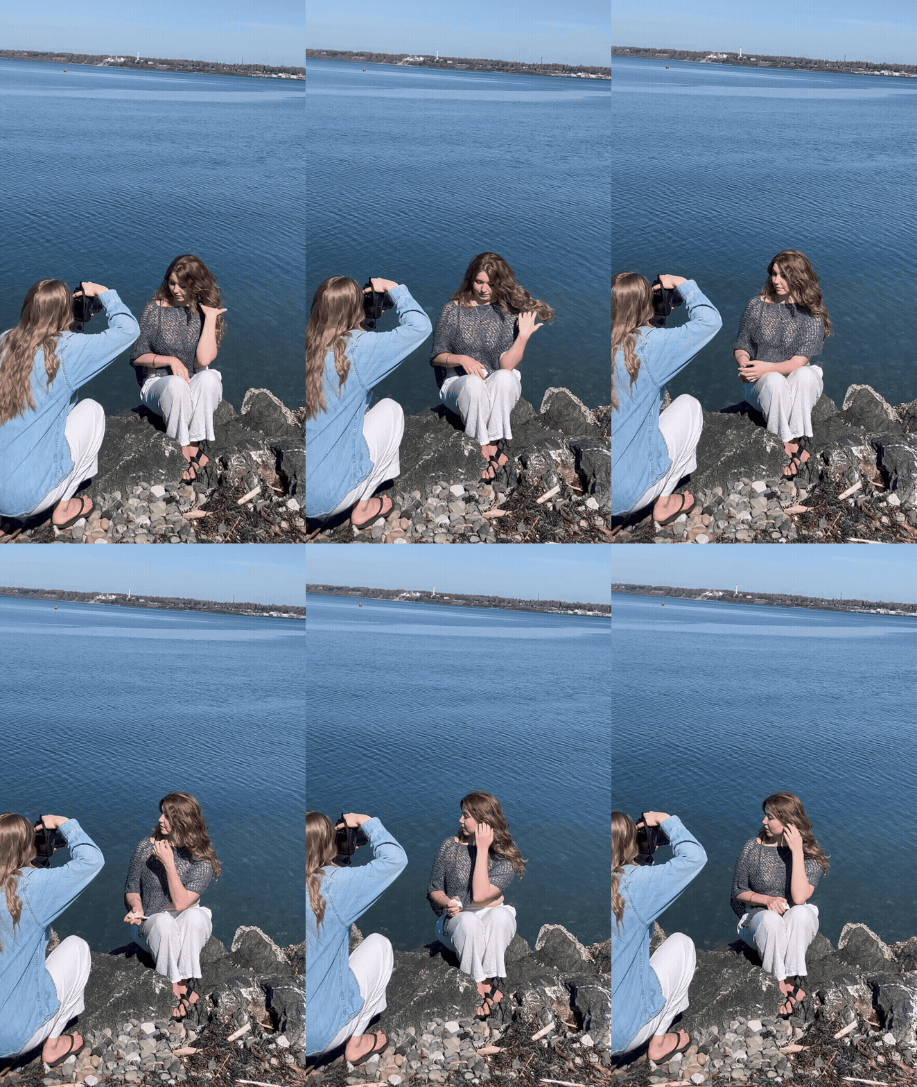
Through these photoshoots, we aimed to emphasize the connection between the jewelry and the natural coastal environment. We held two photo shoots: an environmental shoot and a studio shoot.
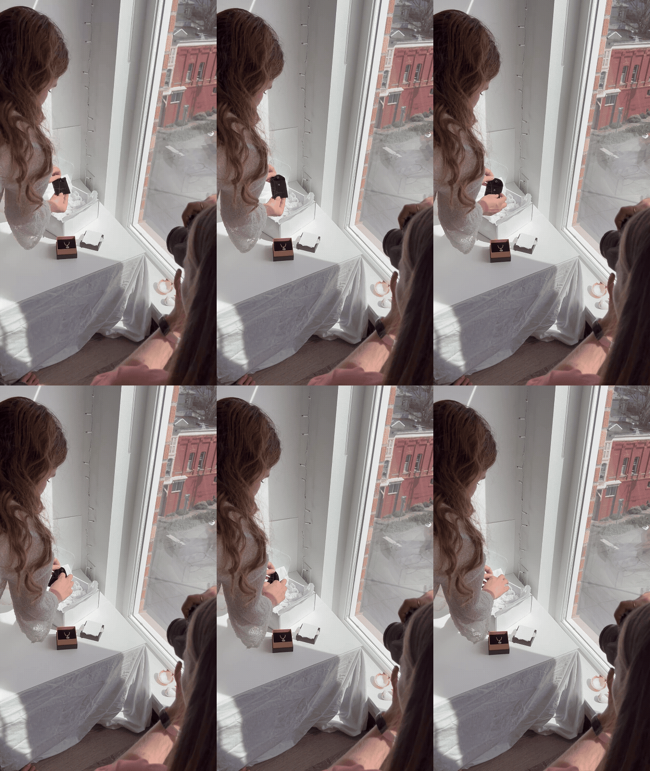
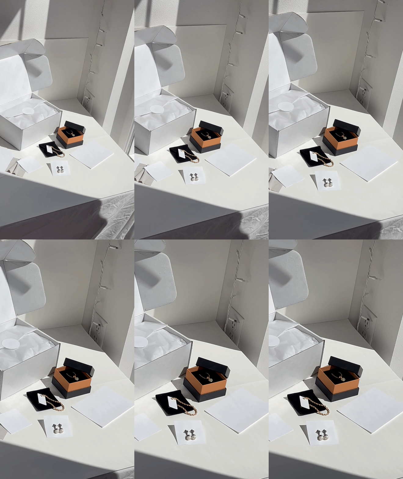
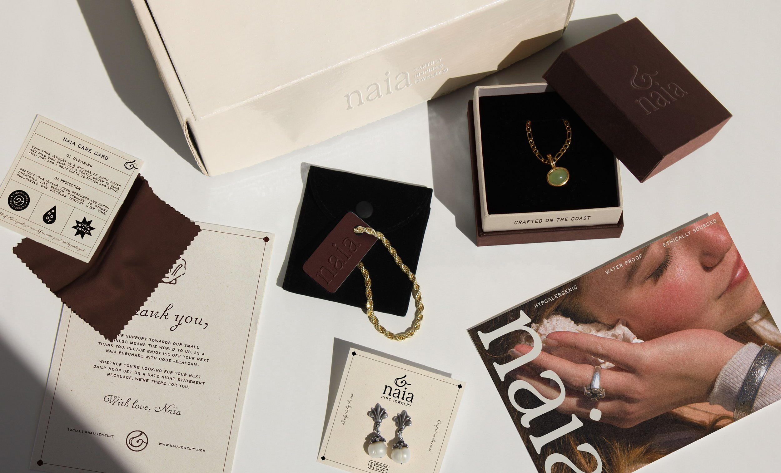
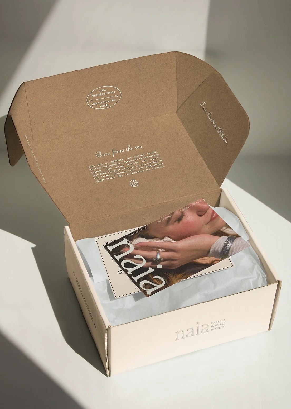
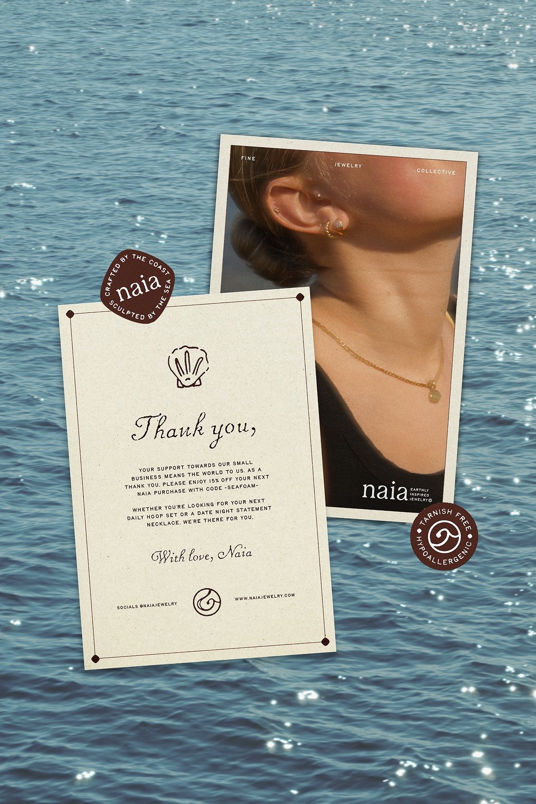
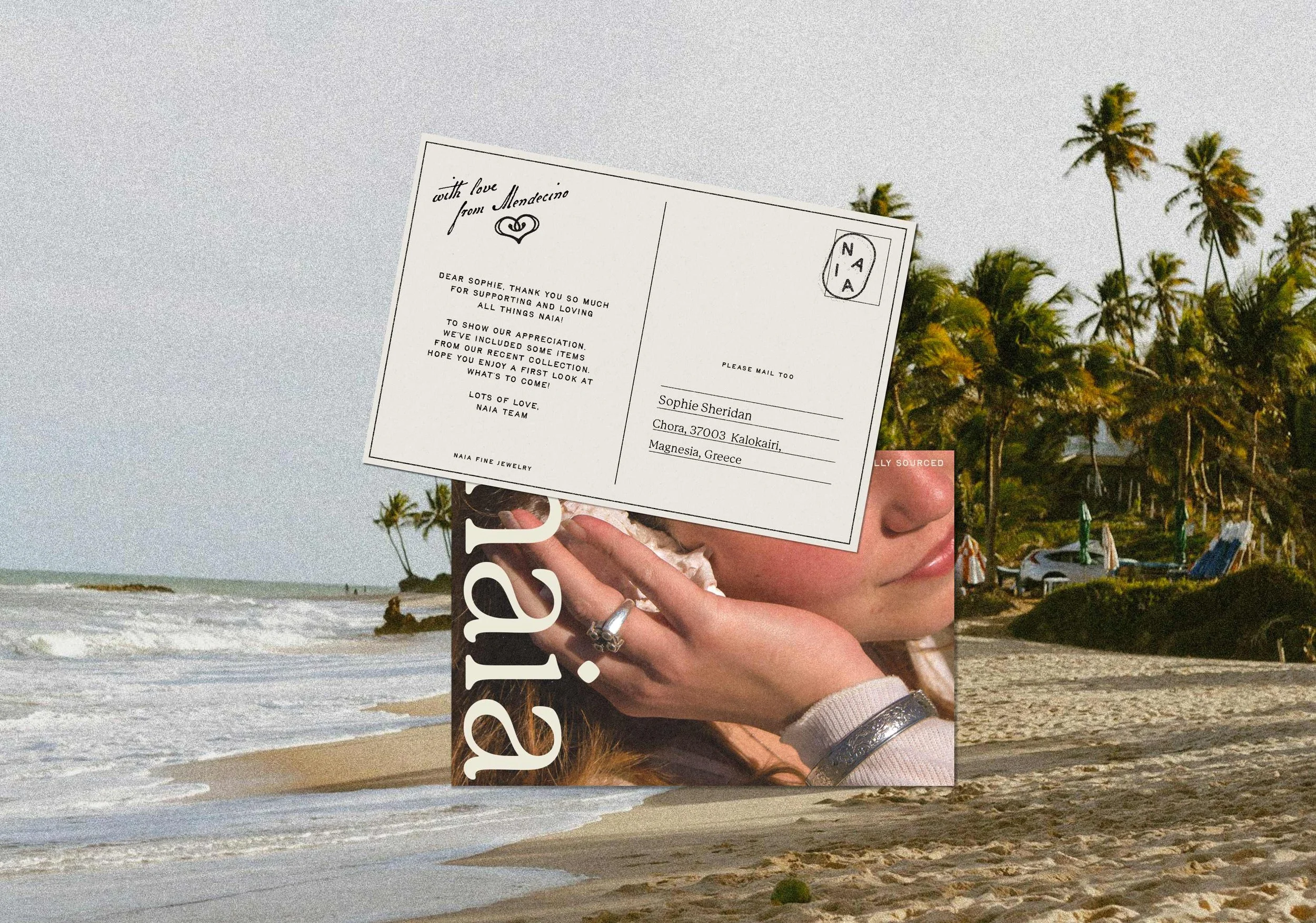
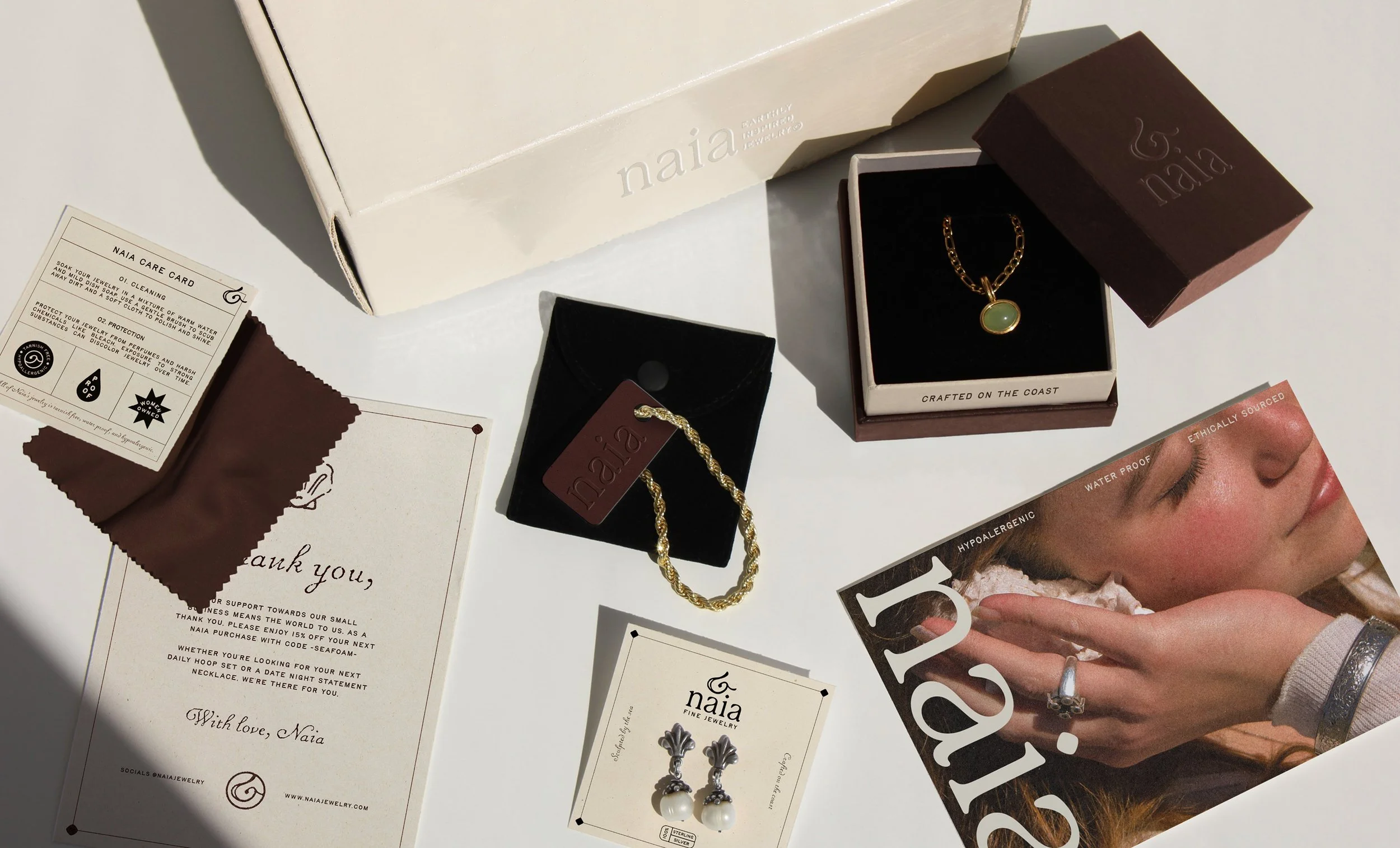
We designed a cohesive PR box set as a key brand deliverable for recurring customers and content creators. It includes a main PR box, a smaller jewelry box with a pouch, a polishing cloth, and a care card, along with branded inserts such as a thank-you & promotional postcard card. Additionally all packaging photos were shot and photoshopped by us.
PR BOX
Packaging
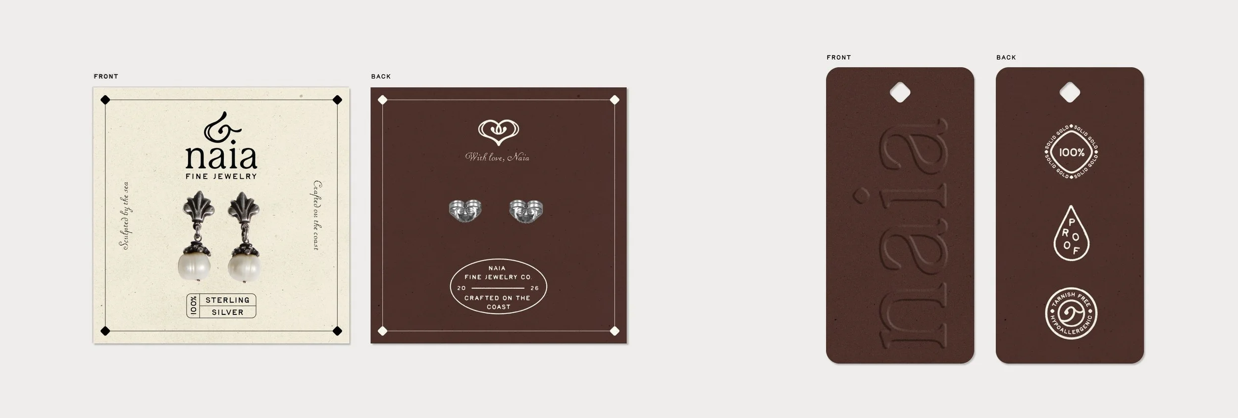
Additionally to the main PR Box, we also developed matching earring cards and tags to ensure a consistent, elevated presentation across all jewelry packaging.
JEWELRY PACKAGING
Packaging
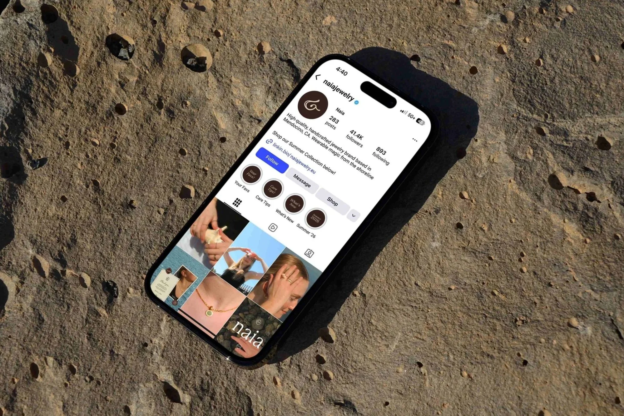
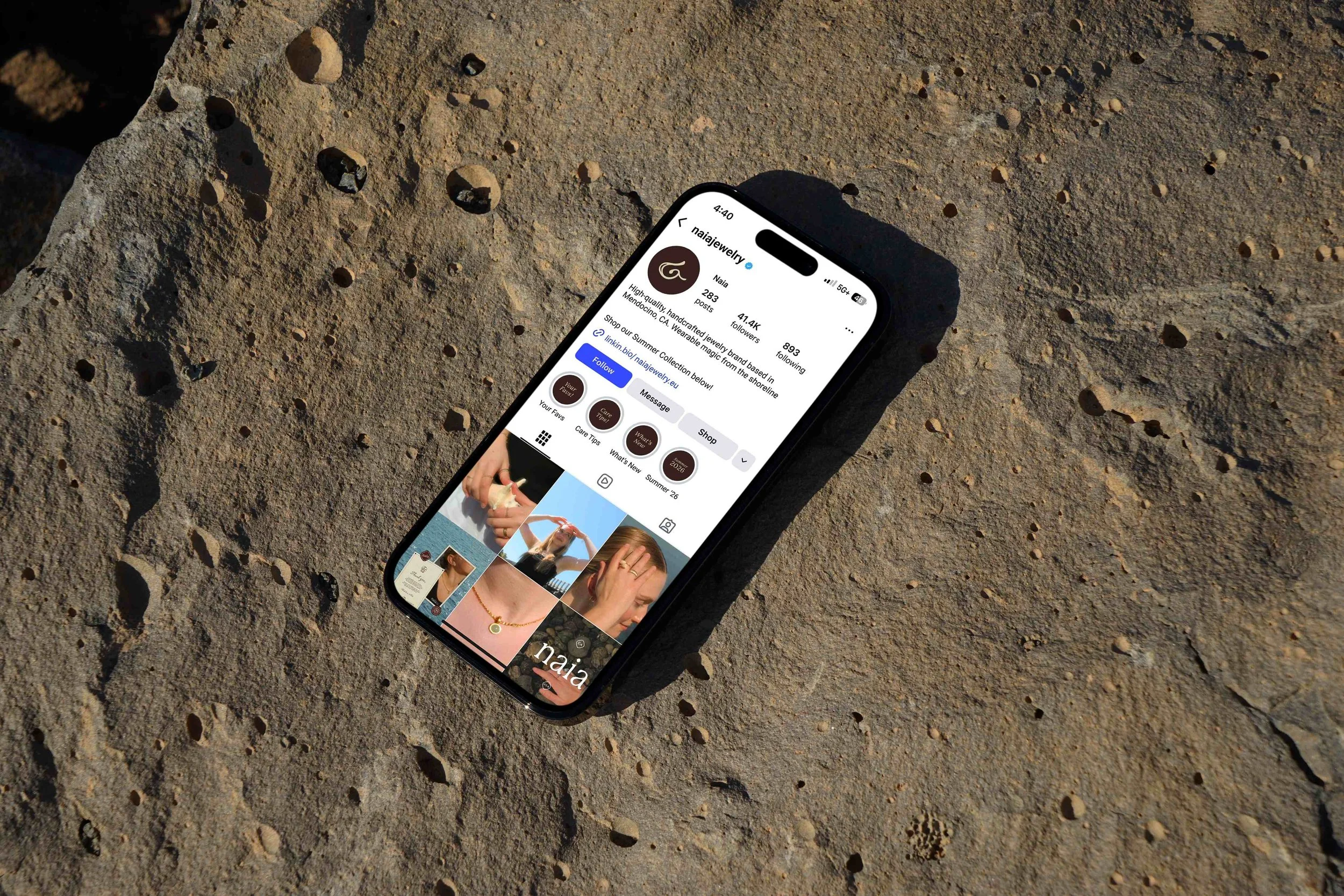
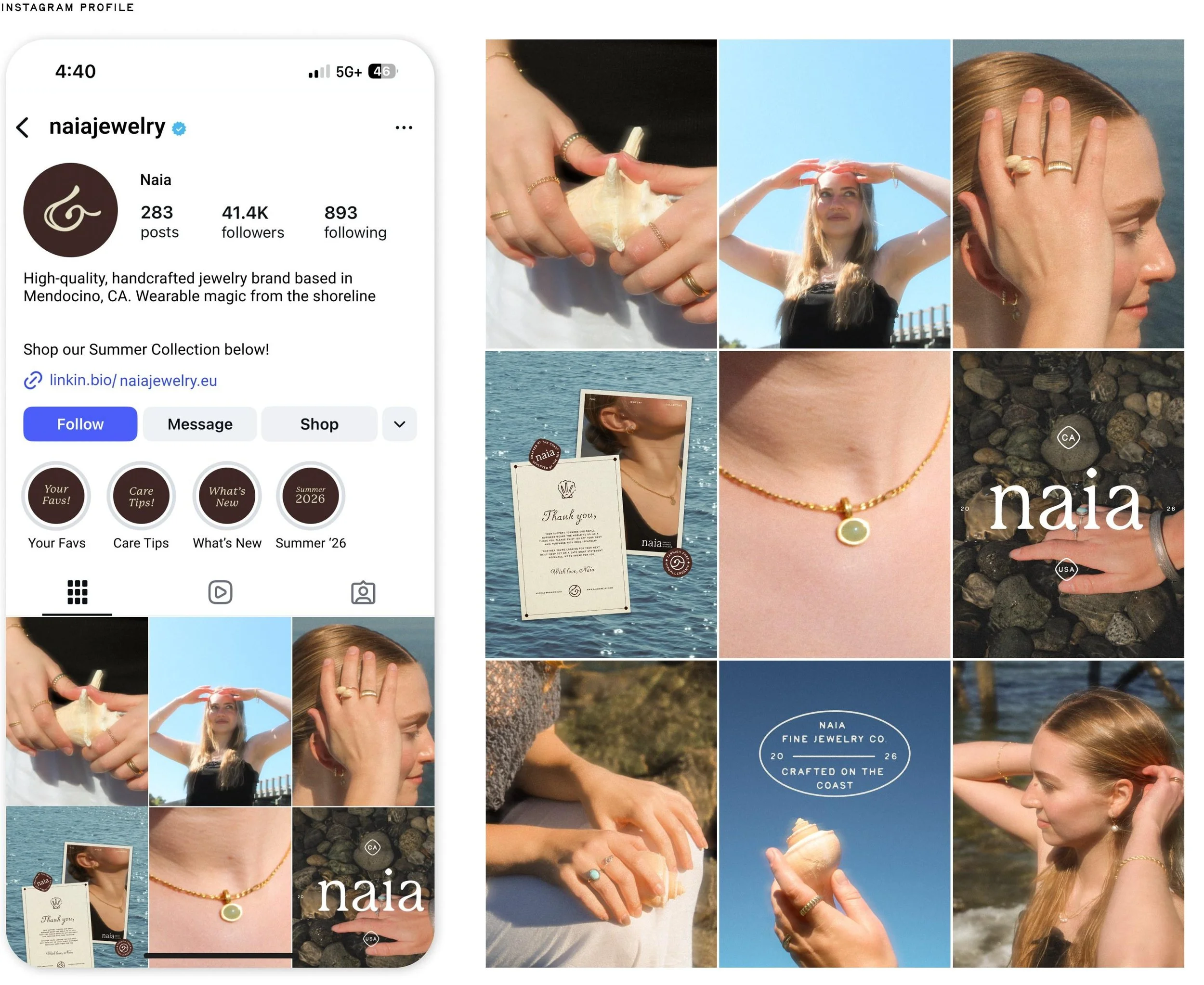
Mendocino is a beautiful coastal town, but it's small. To ensure Naia reaches the most people and becomes a “go-to” destination for jewelry purchases, we built out a strong social presence.
SOCIALS
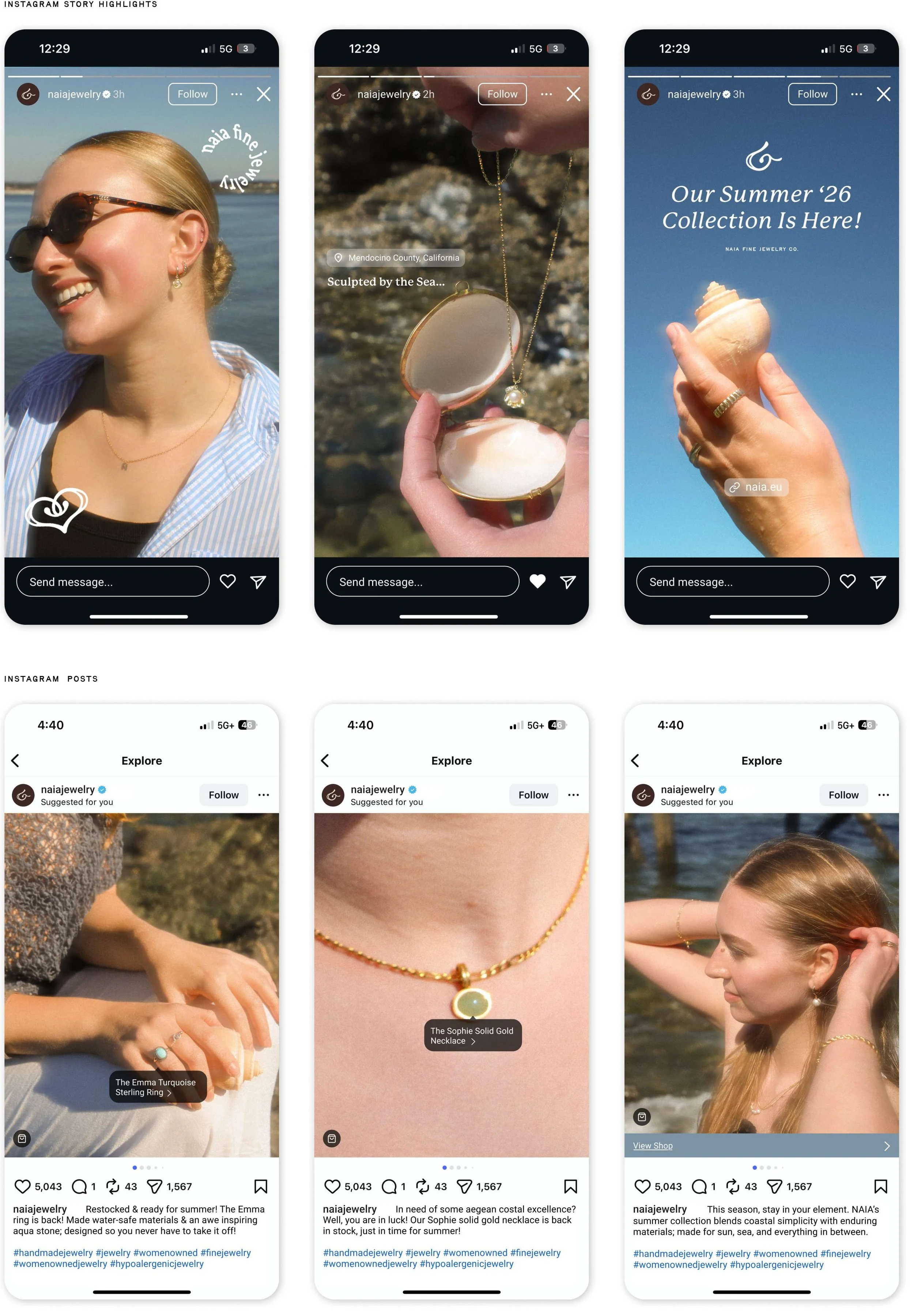
SHORT-FORM REEL
In addition to incorporating our own photography for this project, we recorded a short-form video highlighting the jewelry pieces, capturing the coastal ambience of the beach, and featuring behind-the-scenes content from our outdoor photoshoot.
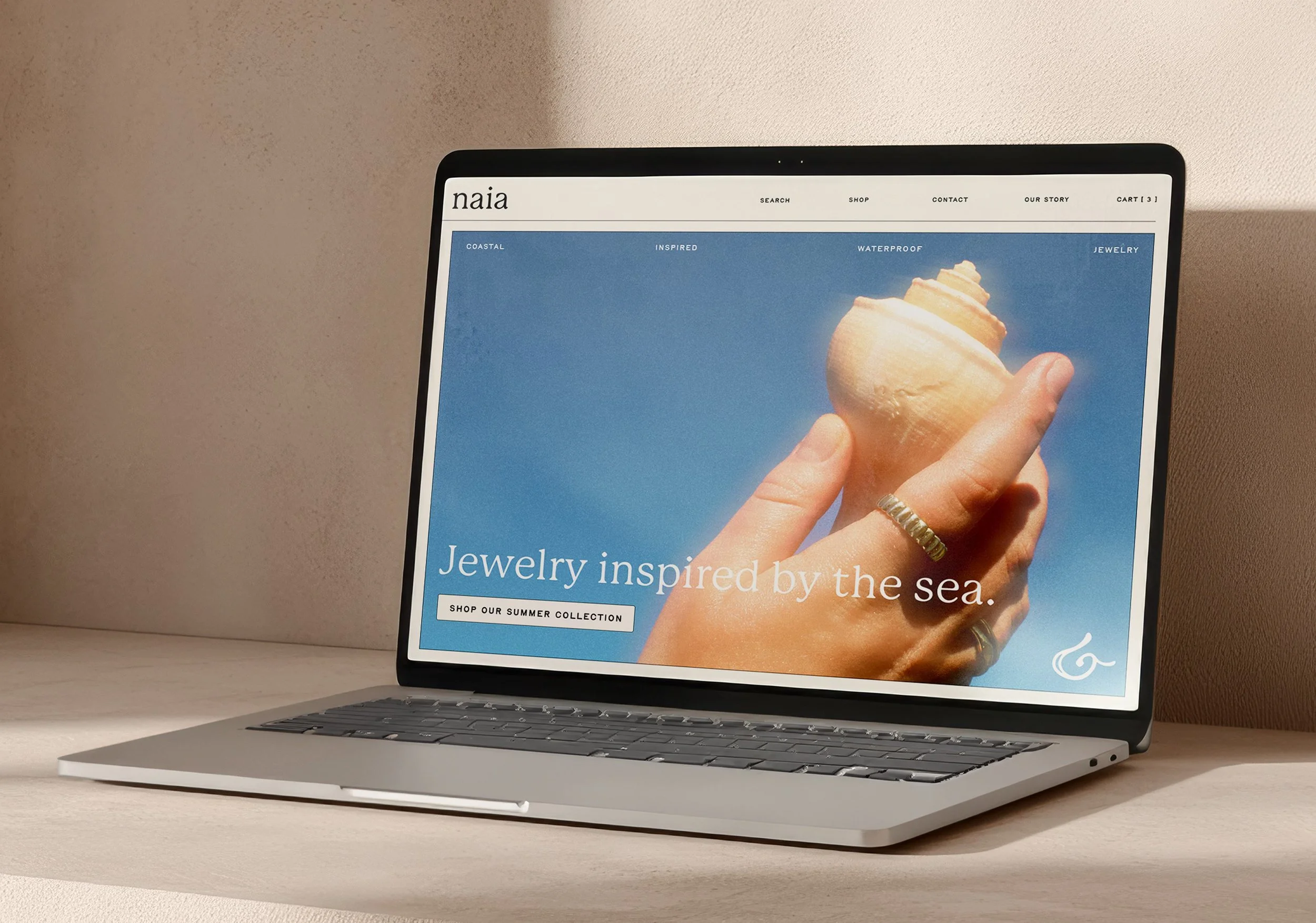
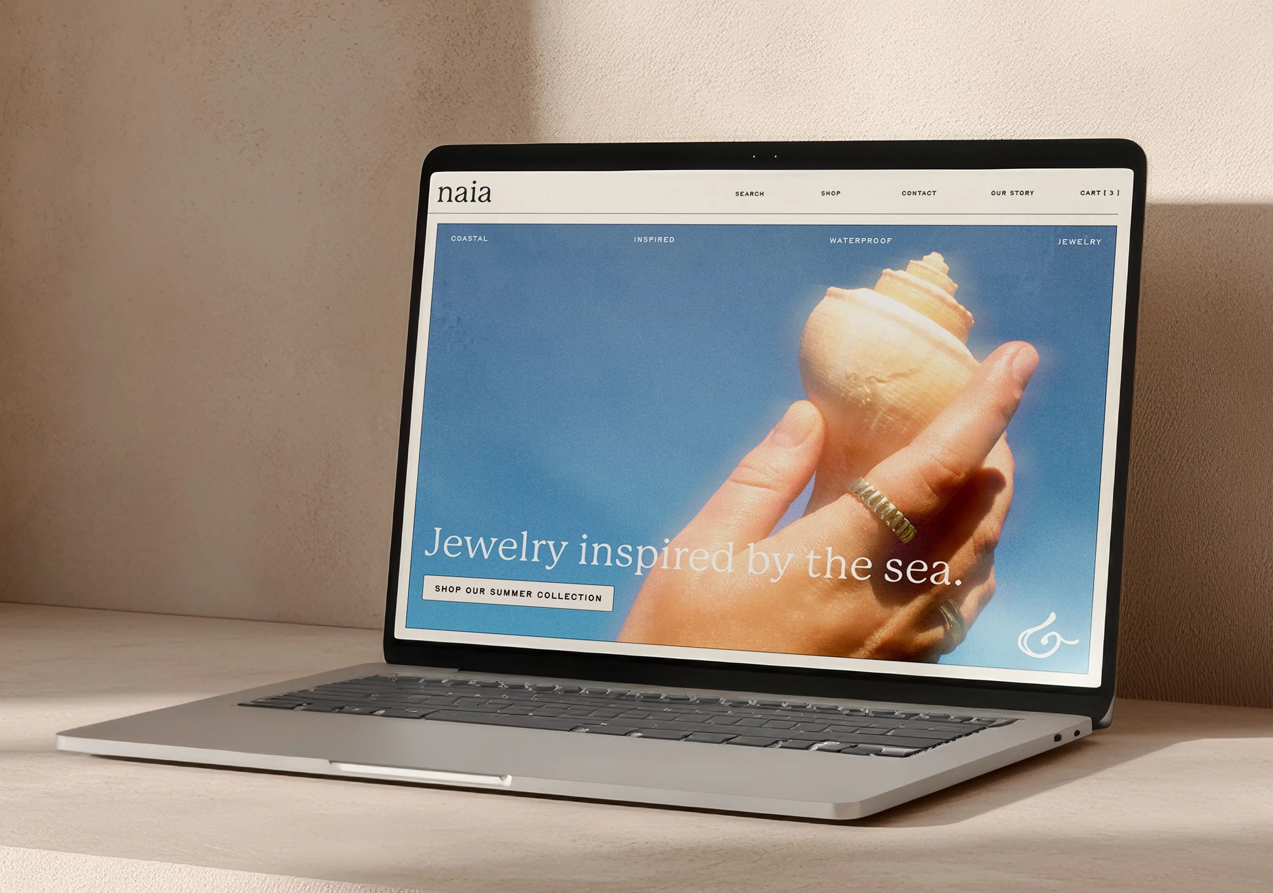
To optimize our outreach and sales, we developed a website for Naia. Current and potential customers can easily navigate to our website, purchase, search our jewelry pieces, learn more about Naia as a brand, and contact the Naia team with any questions.
WEBSITE
Behind The Scenes
Throughout the process of branding Naia, we worked together to plan, direct, shoot, and edit photography. From photographing each other wearing jewelry to creating our own packaging mockups, this project fueled my passion for creative direction and design outside of the computer.
NAIA IN THE MAKING